某勾数据分析系列(三)之数据可视化
環境
python 3.9.0+
macos Big Sur 11.2.3+
Google Chrome 89.0.4389.114
python包 : pandas,re,matplotlib,numpy,os
正文
我們做好了相对应的数据处理,就能产生数据图表也就是可视化分析数据了。 首先,我们要做的数据处理包括,获取平均工资,学历,地点,工作年限 等等。
数据清洗
因为系列中上一篇文章讲了怎么清洗数据的知识,所以我这里直接上代码
class Clean:
def __init__(self):
self.data = pandas.read_json('newData.json')
'''
重組排序規則,使用自己的id作為索引
'''
self.data.index = self.data['id']
del (self.data['id'])
dfSort = self.data.sort_index()
self.data = dfSort
def wageDataRinse(self):
self.data['bottom'] = self.data['top'] = self.data['average'] = self.data['positionWage']
pattern = re.compile('([0-9]+)')
q1 = q2 = q3 = q4 = 0
for i in range(len(self.data['positionWage'])):
item = self.data['positionWage'].iloc[i].strip()
result = re.findall(pattern, item)
try:
if result:
try:
# 此语句执行成功则表示result[0],result[1]都存在,即职位月薪形如‘6000-8000元/月’
self.data['bottom'].iloc[i], self.data['top'].iloc[i] = result[0], result[1]
self.data['average'].iloc[i] = str((int(result[0]) + int(result[1])) / 2)
q1 += 1
except:
# 此语句执行成功则表示result[0]存在,result[1]不存在,职位月薪形如‘10000元/月以下’
self.data['bottom'].iloc[i] = df['top'].iloc[i] = result[0]
self.data['average'].iloc[i] = str((int(result[0]) + int(result[0])) / 2)
q2 += 1
else:
# 此语句执行成功则表示【职位月薪】中并无数字形式存在,可能是‘面议’、‘found no element’
self.data['bottom'].iloc[i] = self.data['top'].iloc[i] = self.data['average'].iloc[i] = item
q3 += 1
except Exception as e:
q4 += 1
# print(q4, item, repr(e))
# return self.data
def cityDataRinse(self):
self.data['jobsCity'] = self.data['jobsAddress']
pattern2 = re.compile('(.*?)(\-)')
dfCity = self.data['jobsAddress'].copy()
for i in range(len(dfCity)):
item = dfCity.iloc[i].strip()
result = re.search(pattern2, item)
if result:
# print(result.group(1).strip())
dfCity.iloc[i] = result.group(1).strip()
else:
# print(item.strip())
dfCity.iloc[i] = item.strip()
self.data['jobsCity'] = dfCity
# return self.data
def jobExp(self):
data = self.data['jobsExp'].value_counts()
# print(data)
'''
工作经验-平均工资
'''
def averageMonthly(self):
dfAvrMonth = self.data['average'].replace(['面议','found no element'],numpy.nan)
averMonthData = pandas.DataFrame(data={'jobsExp': self.data['jobsExp'], 'avrMonth': dfAvrMonth})
pattern = re.compile('([0-9]+)')
avrlist = []
for i in range(len(self.data['average'])):
item = self.data['average'].iloc[i].strip()
result = re.findall(pattern, item)
# print(float(item)*1000)
try:
if result:
avrlist.append(float(float(item)*1000))
elif (item.strip() == 'found no element' or item.strip() == '面议'):
avrlist.append(numpy.nan)
else:
print(item)
except Exception as e:
print(item, type(item), repr(e))
averMonthData['avrMonth'] = avrlist
self.data['avrMonth'] = averMonthData['avrMonth']
avrMonthGroup = averMonthData['avrMonth'].groupby(averMonthData['jobsExp'])
# data = avrMonthGroup.mean()
# print(data)
# pandas.Series(data = {'平均值':averMonthData['avrMonth'].mean()})
result = avrMonthGroup.mean().append(pandas.Series(data = {'平均值':averMonthData['avrMonth'].mean()}))
# data1 = result3.sort_values(ascending=False).round(1)
return result
'''
城市-平均工资
'''
def averCityMonthly(self):
cityAvrMonth = pandas.DataFrame(data={'jobsCity': self.data['jobsCity'], 'avrMonth': self.data['avrMonth']})
cityAvrMonthGroup = cityAvrMonth['avrMonth'].groupby(cityAvrMonth['jobsCity'])
# cityAvrMonthGroup.count().sum()
result = cityAvrMonthGroup.mean().append(pandas.Series(data={'平均值': self.data['avrMonth'].mean()}))# 新增一个平均值,即所有非空df2['平均月薪']的平均值
# print(result.iloc[-1])
# result4.sort_values(ascending=False).round(1) # sort_values()方法可以对值进行排序,默认按照升序,round(1)表示小数点后保留1位小数。
return result
'''
学历-职位数量分布
'''
def averEducationNum(self):
self.data['degreeReq'].value_counts()
minEducation = self.data['degreeReq'].replace(['其他'], numpy.nan)
minEducation.value_counts()
minEducation.value_counts().sum()
# self.data['minDegreeReq'] = minEducation
return minEducation
'''
学历-平均工资分布
'''
def averEducationMonthly(self):
eduMonthly = pandas.DataFrame(data={'degreeReq': self.data['degreeReq'], 'avrMonth': self.data['avrMonth']})
EduMonthlyGroup = eduMonthly['avrMonth'].groupby(eduMonthly['degreeReq'])
# print(EduMonthlyGroup.mean())
return EduMonthlyGroup
'''
学历-工作经验-平均月薪分布
'''
def averJobsExpAndEduForMonthly(self):
jobsExpAndEduForMonthly = pandas.DataFrame(data={'avrMonth': self.data['avrMonth'], 'degreeReq': self.data['degreeReq'], 'jobsExp': self.data['jobsExp']})
jobsExpAndEduForMonthlyGroup = jobsExpAndEduForMonthly['avrMonth'].groupby([jobsExpAndEduForMonthly['degreeReq'], jobsExpAndEduForMonthly['jobsExp']])
return jobsExpAndEduForMonthlyGroup
def getALLData(self):
return self.data
数据可视化
可视化,是个什么概念,意思就是通过把数据通过某个结构做出来的特点数据,这一块叫做分析。通过图表的方式展现出来,这就是可视化。 那当然,Excel的VBA也能做。但是在细节上的处理我觉得python会更甚一筹。而且python同步进行的数据清洗相对来说比Excel减低了很多的工作量 分析数据清洗数据有pandas包,可视化当然也有,那就是matplotlib
首先我要设置一个画布空间,set_size_inches
是个这个画布尺寸,单位是英寸。1英寸等于 2.54 cm。
canvas = plt.figure(1, facecolor='black') # 设置视图画布1
canvas.set_size_inches(18.5, 10.5)
然后就是画图了,看注释
ax1_1 = canvas.add_subplot(2, 1, 1, facecolor='#4f4f4f',alpha=0.3) # 在视图1中设置子图1,背景色灰色,透明度0.3(figure.add_subplot 和plt.suplot都行)
plt.tick_params(colors='white') # 设置轴的颜色为白色
allData['jobsCity'].value_counts().plot(kind='bar', rot=0, color='#ef9d9a') # 画直方图图
# 设置图标题,x和y轴标题
plt.title('城市——python在招职位数分布图', fontsize=18, color='yellow') # 设置标题
plt.xlabel('城市', fontsize=14, color='yellow') # 设置X轴轴标题
plt.ylabel('职位数量', fontsize=14, color='yellow') # 设置Y轴轴标题
# 设置说明,位置在图的右上角
ax1_1.text(13, 453, '城市总数:'+str(len(allData['jobsCity'].value_counts().values))+'(个)', fontsize=12, color='cyan') # 设置说明,位置在图的右上角
ax1_1.text(13, 403, '职位总数:'+str(allData.shape[0])+'(条)', fontsize=12, color='cyan')
ax1_1.text(13, 353, '有效职位:'+str(allData.shape[0])+'(条)', fontsize=12, color='red')
# 添加每一个城市的坐标值
list_1 = allData['jobsCity'].value_counts().values
for i in range(len(list_1)):
ax1_1.text(i - 0.3, list_1[i], str(list_1[i]), color='yellow')
plt.show()
然后这就是一张画好的图了
1618989734200-3qo.png
就是这么简单。所以我做了几个示例。
全部代码
1.main.py
import pandas
import re
import numpy
import drawVisual
import os
'''判断文件夹是否存在'''
def dirNotExistCreate(path):
if not os.path.exists(path):
os.mkdir(path)
class Clean:
def __init__(self):
self.data = pandas.read_json('newData.json')
'''
重組排序規則,使用自己的id作為索引
'''
self.data.index = self.data['id']
del (self.data['id'])
dfSort = self.data.sort_index()
self.data = dfSort
def wageDataRinse(self):
self.data['bottom'] = self.data['top'] = self.data['average'] = self.data['positionWage']
pattern = re.compile('([0-9]+)')
q1 = q2 = q3 = q4 = 0
for i in range(len(self.data['positionWage'])):
item = self.data['positionWage'].iloc[i].strip()
result = re.findall(pattern, item)
try:
if result:
try:
# 此语句执行成功则表示result[0],result[1]都存在,即职位月薪形如‘6000-8000元/月’
self.data['bottom'].iloc[i], self.data['top'].iloc[i] = result[0], result[1]
self.data['average'].iloc[i] = str((int(result[0]) + int(result[1])) / 2)
q1 += 1
except:
# 此语句执行成功则表示result[0]存在,result[1]不存在,职位月薪形如‘10000元/月以下’
self.data['bottom'].iloc[i] = df['top'].iloc[i] = result[0]
self.data['average'].iloc[i] = str((int(result[0]) + int(result[0])) / 2)
q2 += 1
else:
# 此语句执行成功则表示【职位月薪】中并无数字形式存在,可能是‘面议’、‘found no element’
self.data['bottom'].iloc[i] = self.data['top'].iloc[i] = self.data['average'].iloc[i] = item
q3 += 1
except Exception as e:
q4 += 1
# print(q4, item, repr(e))
# return self.data
def cityDataRinse(self):
self.data['jobsCity'] = self.data['jobsAddress']
pattern2 = re.compile('(.*?)(\-)')
dfCity = self.data['jobsAddress'].copy()
for i in range(len(dfCity)):
item = dfCity.iloc[i].strip()
result = re.search(pattern2, item)
if result:
# print(result.group(1).strip())
dfCity.iloc[i] = result.group(1).strip()
else:
# print(item.strip())
dfCity.iloc[i] = item.strip()
self.data['jobsCity'] = dfCity
# return self.data
def jobExp(self):
data = self.data['jobsExp'].value_counts()
# print(data)
'''
平均工资
'''
def averageMonthly(self):
dfAvrMonth = self.data['average'].replace(['面议','found no element'],numpy.nan)
averMonthData = pandas.DataFrame(data={'jobsExp': self.data['jobsExp'], 'avrMonth': dfAvrMonth})
pattern = re.compile('([0-9]+)')
avrlist = []
for i in range(len(self.data['average'])):
item = self.data['average'].iloc[i].strip()
result = re.findall(pattern, item)
# print(float(item)*1000)
try:
if result:
avrlist.append(float(float(item)*1000))
elif (item.strip() == 'found no element' or item.strip() == '面议'):
avrlist.append(numpy.nan)
else:
print(item)
except Exception as e:
print(item, type(item), repr(e))
averMonthData['avrMonth'] = avrlist
self.data['avrMonth'] = averMonthData['avrMonth']
avrMonthGroup = averMonthData['avrMonth'].groupby(averMonthData['jobsExp'])
# data = avrMonthGroup.mean()
# print(data)
# pandas.Series(data = {'平均值':averMonthData['avrMonth'].mean()})
result = avrMonthGroup.mean().append(pandas.Series(data = {'平均值':averMonthData['avrMonth'].mean()}))
# data1 = result3.sort_values(ascending=False).round(1)
return result
'''
城市-平均工资
'''
def averCityMonthly(self):
cityAvrMonth = pandas.DataFrame(data={'jobsCity': self.data['jobsCity'], 'avrMonth': self.data['avrMonth']})
cityAvrMonthGroup = cityAvrMonth['avrMonth'].groupby(cityAvrMonth['jobsCity'])
# cityAvrMonthGroup.count().sum()
result = cityAvrMonthGroup.mean().append(pandas.Series(data={'平均值': self.data['avrMonth'].mean()}))# 新增一个平均值,即所有非空df2['平均月薪']的平均值
# print(result.iloc[-1])
# result4.sort_values(ascending=False).round(1) # sort_values()方法可以对值进行排序,默认按照升序,round(1)表示小数点后保留1位小数。
return result
'''
学历-职位数量分布
'''
def averEducationNum(self):
self.data['degreeReq'].value_counts()
minEducation = self.data['degreeReq'].replace(['其他'], numpy.nan)
minEducation.value_counts()
minEducation.value_counts().sum()
# self.data['minDegreeReq'] = minEducation
return minEducation
'''
学历-平均工资分布
'''
def averEducationMonthly(self):
eduMonthly = pandas.DataFrame(data={'degreeReq': self.data['degreeReq'], 'avrMonth': self.data['avrMonth']})
EduMonthlyGroup = eduMonthly['avrMonth'].groupby(eduMonthly['degreeReq'])
# print(EduMonthlyGroup.mean())
return EduMonthlyGroup
def averJobsExpAndEduForMonthly(self):
jobsExpAndEduForMonthly = pandas.DataFrame(data={'avrMonth': self.data['avrMonth'], 'degreeReq': self.data['degreeReq'], 'jobsExp': self.data['jobsExp']})
jobsExpAndEduForMonthlyGroup = jobsExpAndEduForMonthly['avrMonth'].groupby([jobsExpAndEduForMonthly['degreeReq'], jobsExpAndEduForMonthly['jobsExp']])
return jobsExpAndEduForMonthlyGroup
def getALLData(self):
return self.data
if __name__ == '__main__':
data = pandas.read_json('newData.json')
dirNotExistCreate('./canvas/')
'''
清洗数据
'''
clean = Clean()
clean.wageDataRinse()
clean.cityDataRinse()
clean.jobExp()
avrMonth = clean.averageMonthly()
cityAvrMonth = clean.averCityMonthly()
eduAvrNum = clean.averEducationNum()
eduMonthly = clean.averEducationMonthly()
jobsExpAndEduForMonthly = clean.averJobsExpAndEduForMonthly()
resData = clean.getALLData()
'''
数据分析之可视化
'''
draw = drawVisual.Draw()
draw.drawCityNum(resData,'cityNum.jpg')
draw.drawJobsExp(resData,'jobsExp.jpg')
draw.drawJobExpAndAvrMonth(avrMonth,resData,'jobExpavrMonth.jpg')
draw.drawCityAndAvrMonth(cityAvrMonth,resData,'cityAvrMonth.jpg')
draw.drawEduAndCount(eduAvrNum,resData,'eduCount.jpg')
draw.drawEduMonthly(eduMonthly,resData,'eduAvrMonth.jpg')
draw.drawJobsExpAndEduForMonthly(jobsExpAndEduForMonthly,resData,'jobExpEduMonth.jpg')
2.drawVisual.py
import matplotlib.pyplot as plt
import numpy
import matplotlib.ticker as mticker
class Draw:
def __init__(self):
plt.rcParams['font.sans-serif'] = ['Heiti TC']
self.key = 'Python'
self.dataSource = '拉勾网'
'''
城市职位数量
'''
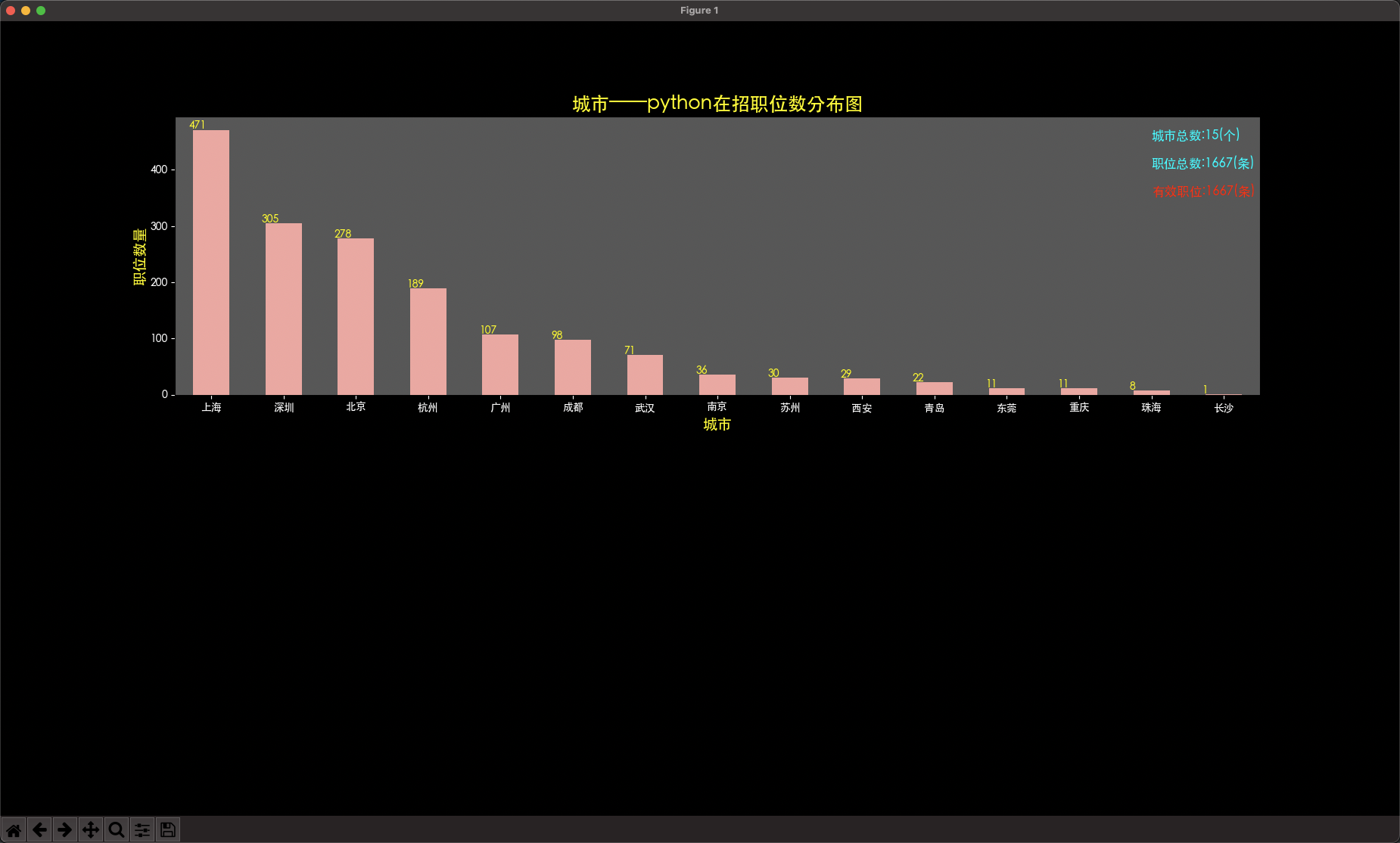
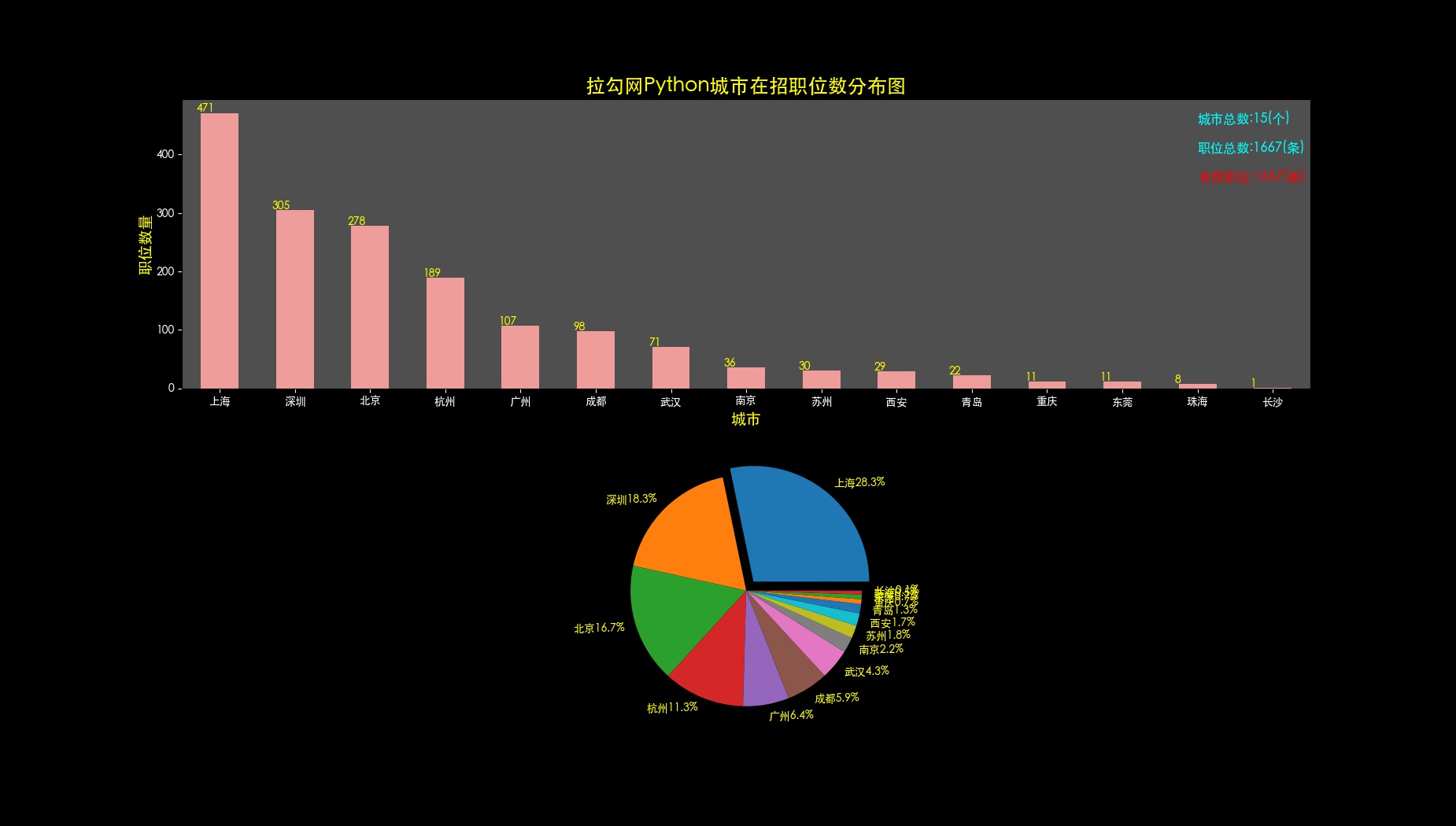
def drawCityNum(self,allData,fileName):
canvas = plt.figure(1, facecolor='black') # 设置视图画布1
canvas.set_size_inches(18.5, 10.5)
ax1_1 = canvas.add_subplot(2, 1, 1, facecolor='#4f4f4f',alpha=0.3) # 在视图1中设置子图1,背景色灰色,透明度0.3(figure.add_subplot 和plt.suplot都行)
plt.tick_params(colors='white') # 设置轴的颜色为白色
allData['jobsCity'].value_counts().plot(kind='bar', rot=0, color='#ef9d9a') # 画直方图图
# 设置图标题,x和y轴标题
plt.title(self.dataSource + self.key + '城市在招职位数分布图', fontsize=18, color='yellow') # 设置标题
plt.xlabel('城市', fontsize=14, color='yellow') # 设置X轴轴标题
plt.ylabel('职位数量', fontsize=14, color='yellow') # 设置Y轴轴标题
# 设置说明,位置在图的右上角
ax1_1.text(13, 453, '城市总数:'+str(len(allData['jobsCity'].value_counts().values))+'(个)', fontsize=12, color='cyan') # 设置说明,位置在图的右上角
ax1_1.text(13, 403, '职位总数:'+str(allData.shape[0])+'(条)', fontsize=12, color='cyan')
ax1_1.text(13, 353, '有效职位:'+str(allData.shape[0])+'(条)', fontsize=12, color='red')
# 添加每一个城市的坐标值
list_1 = allData['jobsCity'].value_counts().values
for i in range(len(list_1)):
ax1_1.text(i - 0.3, list_1[i], str(list_1[i]), color='yellow')
# 可以用plt.grid(True)添加栅格线
# 可以用下面语句添加注释箭头。指向上海,xy为坐标值、xytext为注释坐标值,facecolor为箭头颜色。
# arrow = plt.annotate('职位数:xxx', xy=(1,xxx), xytext=(3, xxx),color='blue',arrowprops=dict(facecolor='blue', shrink=0.05))
ax1_2 = canvas.add_subplot(2, 1, 2) # 设置子图2,是位于子图1下面的饼状图
x = allData['jobsCity'].value_counts().values # x是数值列表,pie图的比例根据数值占整体的比例而划分
label_list = [] # label_list是构造的列表,装的是前8个城市的名称+职位占比。
for i in range(15):
t = allData['jobsCity'].value_counts().values[i] / allData['jobsCity'].value_counts().sum() * 100
city = allData['jobsCity'].value_counts().index[i]
percent = str('%.1f%%' % t)
label_list.append(city + percent)
# labels参数原本是与数值对应的标签列表,此处30个城市过多,所以只取了前8个城市显示。
# explode即饼图中分裂的效果explode=(0.1,1,1,。。)表示第一块图片显示为分裂效果
labels = label_list
explode = tuple([0.1] + [0] * 14)
# x = [471, 305, 278, 189, 107, 98, 71, 36, 30, 29, 22, 11, 11, 8, 1]
# print(len(labels),len(x),len(explode))
plt.pie(x, explode=explode, labels=labels, textprops={'color': 'yellow'})
if not fileName:
plt.show()
else:
plt.savefig('./canvas/'+fileName,dpi=100)
'''工作经验——职位数分布图'''
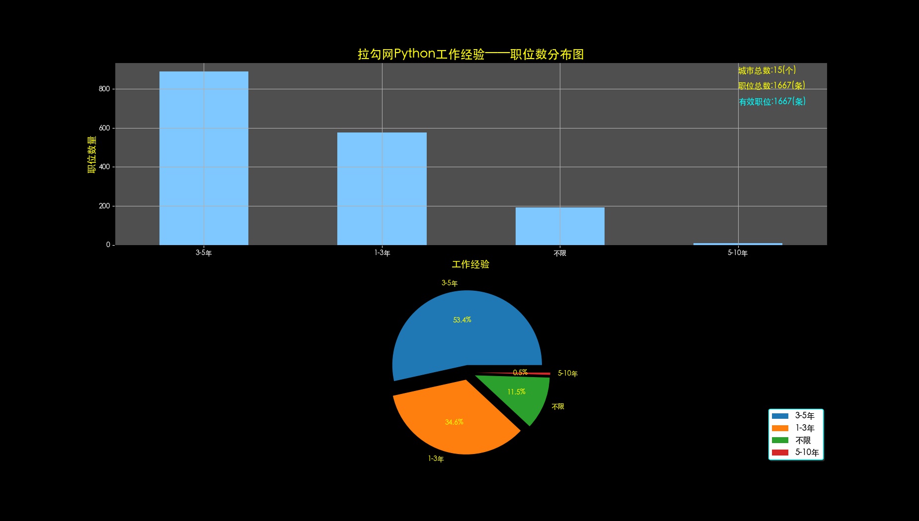
def drawJobsExp(self,data,fileName):
canvas = plt.figure(2, facecolor='black')
canvas.set_size_inches(18.5,10.5)
'''图表1-1-1'''
ax1_1 = canvas.add_subplot(2, 1, 1, facecolor='#4f4f4f', alpha=0.3)
data['jobsExp'].value_counts().plot(kind='bar', rot=0, color='#7fc8ff')
plt.tick_params(colors='white')
plt.title(self.dataSource + self.key + '工作经验——职位数分布图', fontsize=18, color='yellow')#标题
plt.xlabel('工作经验', fontsize=14, color='yellow')#x轴
plt.ylabel('职位数量', fontsize=14, color='yellow')#y轴
plt.grid(True)
ax1_1.text(3, 880, '城市总数:'+ str(len(data['jobsCity'].value_counts().values))+'(个)', fontsize=12, color='yellow')
ax1_1.text(3, 800, '职位总数:'+str(data.shape[0])+'(条)', fontsize=12, color='yellow')
ax1_1.text(3, 720, '有效职位:'+str(data.shape[0])+'(条)', fontsize=12, color='cyan')
'''图表1-1-2'''
ax1_2 = canvas.add_subplot(2, 1, 2)
# x是数值列表,pie图的比例根据数值占整体的比例而划分
x2 = data['jobsExp'].value_counts().values
labels = list(data['jobsExp'].value_counts().index[:len(x2)])
explode = tuple([0.1] * len(x2))
plt.pie(x2, explode=explode, labels=labels, autopct='%1.1f%%', textprops={'color': 'yellow'})
plt.axis('equal') # 显示为等比例圆形
ax1_2.legend(loc='lower right', shadow=True, fontsize=12, edgecolor='cyan')# 设置图例,方位为右下角
if not fileName:
plt.show()
else:
plt.savefig('./canvas/'+fileName,dpi=100)
'''工作经验——平均月薪分布图'''
def drawJobExpAndAvrMonth(self,data,allData,fileName):
avrData = data.iloc[-1]
plt.style.use('ggplot')
canvas = plt.figure(3, facecolor='black')
canvas.set_size_inches(18.5, 10.5)
ax3 = canvas.add_subplot(1, 1, 1, facecolor='#4f4f4f', alpha=0.3)
data.sort_values(ascending=False).round(1).plot(kind='barh', rot=0)
# 设置标题、x轴、y轴的标签文本
plt.title(self.dataSource + self.key + '工作经验——平均月薪分布图', fontsize=18, color='yellow')
plt.xlabel('平均月薪', fontsize=14, color='yellow')
plt.ylabel('工作经验', fontsize=14, color='yellow')
# 添加值标签
list3 = data.sort_values(ascending=False).values
for i in range(len(list3)):
ax3.text(list3[i], i, str(int(list3[i])), color='yellow')
# 设置标识箭头
plt.annotate('平均月薪:'+str(int(avrData))+'元/月', xy=(14197, 2.25), xytext=(20000, 3.05), color='yellow', fontsize=16, arrowprops=dict(facecolor='cyan', shrink=0.05))
ax3.text(30250, 4.25, '月薪样本数:'+str(allData.shape[0])+'(个)', fontsize=16, color='cyan')# 设置图例注释(alldata['xxx'].value_counts().sum())
# 设置轴刻度文字颜色为白色
plt.tick_params(colors='white')
if not fileName:
plt.show()
else:
plt.savefig('./canvas/'+fileName,dpi=100)
'''
城市-月均工资
'''
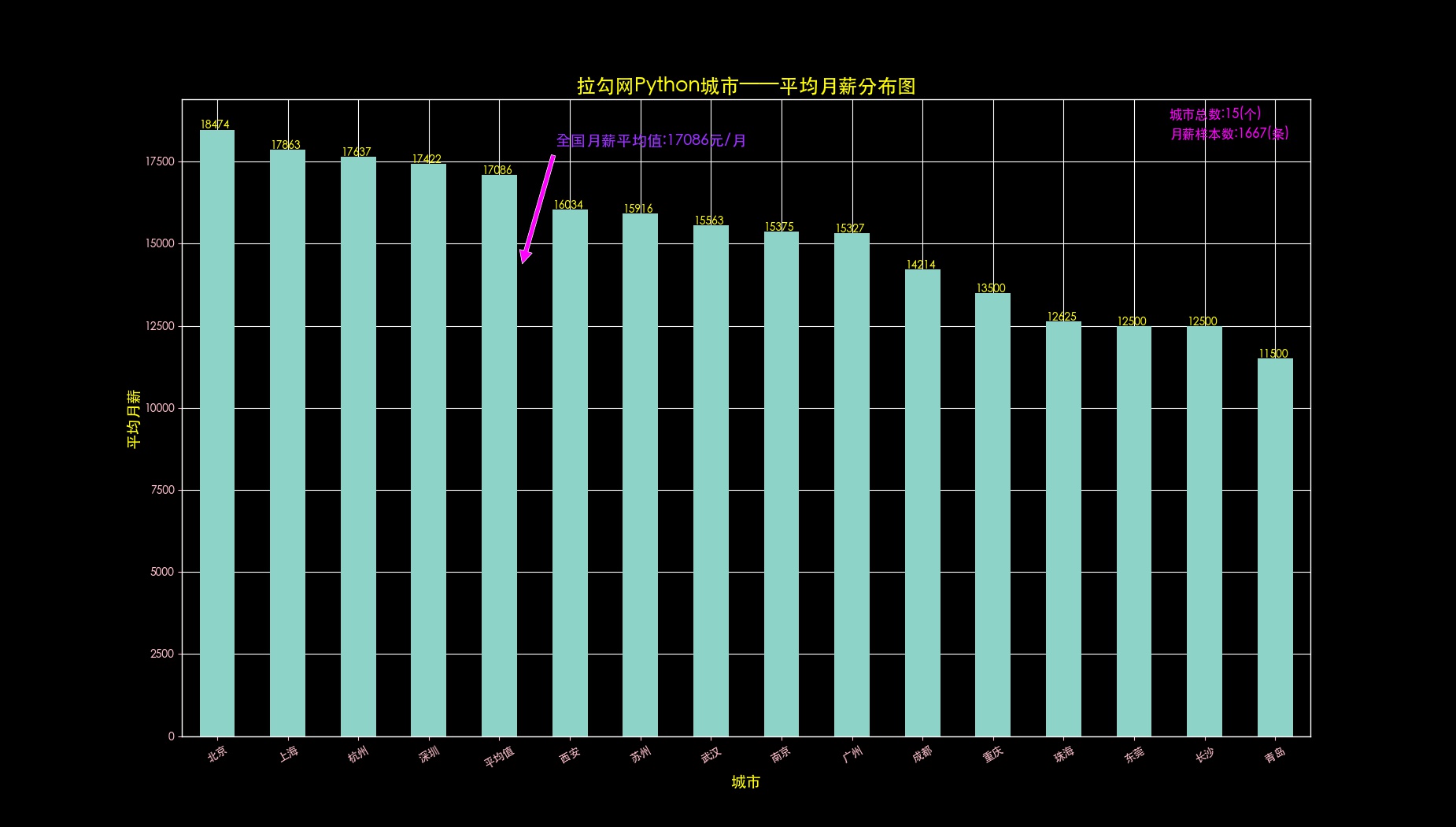
def drawCityAndAvrMonth(self,data,allData,fileName):
avrData = data.iloc[-1]
plt.style.use('dark_background')
canvas = plt.figure(4)
canvas.set_size_inches(18.5, 10.5)
ax = canvas.add_subplot(1, 1, 1) # 可选facecolor='#4f4f4f',alpha=0.3,设置子图,背景色灰色,透明度0.3
data.sort_values(ascending=False).round(1).plot(kind='bar', rot=30) # 可选color='#ef9d9a'
plt.title(self.dataSource + self.key + u'城市——平均月薪分布图', fontsize=18, color='yellow') # 设置标题
plt.xlabel(u'城市', fontsize=14, color='yellow') # 设置X轴轴标题
plt.ylabel(u'平均月薪', fontsize=14, color='yellow') # 设置Y轴轴标题
ax.text(13.5, 18800, u'城市总数:'+str(len(allData['jobsCity'].value_counts().values))+'(个)', fontsize=12, color='#FF00FF') # 设置说明,位置在图的右上角
ax.text(13.5, 18200, u'月薪样本数:'+str(allData.shape[0])+'(条)', fontsize=12, color='#FF00FF')
listData = data.sort_values(ascending=False).values # 添加每一个城市的坐标值
for i in range(len(listData)):
ax.text(i-0.25, listData[i], int(listData[i]), color='yellow')
plt.annotate(u'全国月薪平均值:'+str(int(avrData))+'元/月', xy=(4.3, 14197), xytext=(4.8, 18000), color='#9B30FF', fontsize=14,arrowprops=dict(facecolor='#FF00FF', shrink=0.05))# 设置箭头注释
plt.tick_params(colors='pink')# 设置轴刻度文字颜色为粉色
if not fileName:
plt.show()
else:
plt.savefig('./canvas/'+fileName,dpi=100)
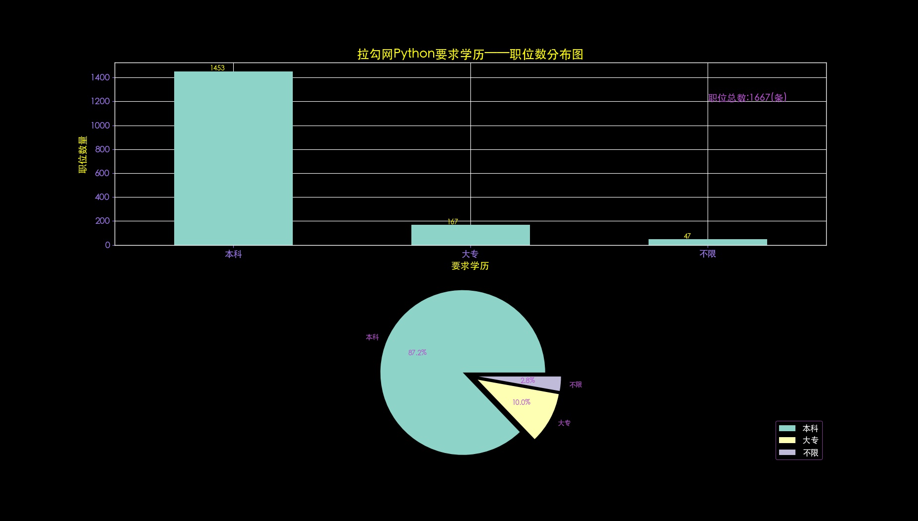
def drawEduAndCount(self,data,allData,fileName):
plt.style.use('dark_background')
canvas = plt.figure(5)
canvas.set_size_inches(18.5, 10.5)
ax1_1 = canvas.add_subplot(2, 1, 1) # 可选facecolor='#4f4f4f',alpha=0.3
data.value_counts().plot(kind='bar', rot=0) # color='#7fc8ff'
# 设置标题、x轴和y轴标题、图例文字
plt.title(self.dataSource + self.key + u'要求学历——职位数分布图', fontsize=18, color='yellow')
plt.xlabel(u'要求学历', fontsize=14, color='yellow')
plt.ylabel(u'职位数量', fontsize=14, color='yellow')
ax1_1.text(2, 1200, u'职位总数:'+ str(allData.shape[0]) +'(条)', fontsize=14, color='#B452CD')
# 设置坐标轴的的颜色和文字大小
plt.tick_params(colors='#9F79EE', labelsize=13)
# 设置坐标值文字
list5 = data.value_counts().values
for i in range(len(list5)):
ax1_1.text(i - 0.1, list5[i], int(list5[i]), color='yellow')
ax1_2 = canvas.add_subplot(2, 1, 2)
xl = data.value_counts().values
labels = list(data.value_counts().index)
explode = tuple([0.1] * len(xl))
plt.pie(xl, explode=explode, labels=labels, autopct='%1.1f%%', textprops={'color': '#B452CD'})
plt.axis('equal')
ax1_2.legend(loc='lower right', shadow=True, fontsize=12, edgecolor='#B452CD')
plt.tick_params(colors='#9F79EE', labelsize=13)
if not fileName:
plt.show()
else:
plt.savefig('./canvas/'+fileName,dpi=100)
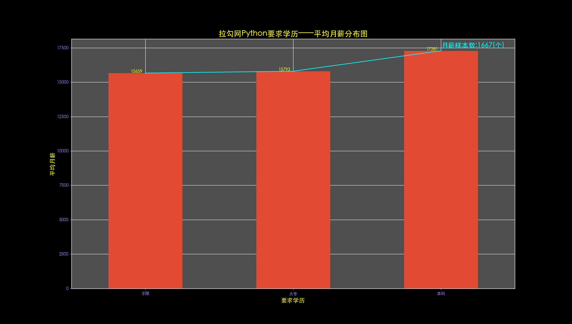
def drawEduMonthly(self,data,allData,fileName):
plt.style.use('ggplot')
canvas = plt.figure(6, facecolor='black')
canvas.set_size_inches(18.5, 10.5)
ax = canvas.add_subplot(1, 1, 1, facecolor='#4f4f4f', alpha=0.3)
data.mean().round(1).sort_values().plot(color='cyan') # 在条形图上叠加一个折线图
data.mean().round(1).sort_values().plot(kind='bar', rot=0)
# 设置标题、x轴、y轴的标签文本
plt.title(self.dataSource + self.key + u'要求学历——平均月薪分布图', fontsize=18, color='yellow')
plt.xlabel(u'要求学历', fontsize=14, color='yellow')
plt.ylabel(u'平均月薪', fontsize=14, color='yellow')
# 添加值标签(坐标值文字)
listData = data.mean().round(1).sort_values().values
for i in range(len(listData)):
ax.text(i - 0.1, listData[i], int(listData[i]), color='yellow')
# 设置图例注释
ax.text(2, 17500, u'月薪样本数:'+str(allData.shape[0])+'(个)', fontsize=16, color='cyan')
# 设置轴刻度的文字颜色
plt.tick_params(colors='#9F79EE')
if not fileName:
plt.show()
else:
plt.savefig('./canvas/'+fileName,dpi=100)
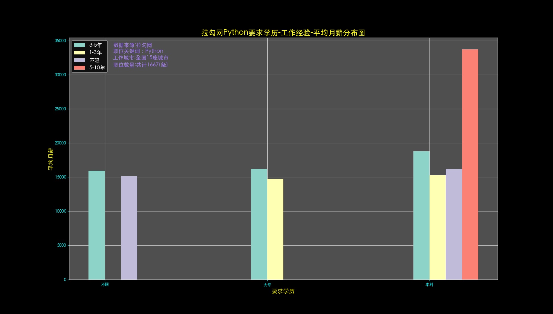
def drawJobsExpAndEduForMonthly(self,data,allData,fileName):
xlist = list(data.mean().round(1)[:, '3-5年'].sort_values().index)
print(xlist)
data.mean().round(1)[:, '1-3年'].reindex(xlist)
plt.style.use('dark_background')
canvas = plt.figure(7, facecolor='black')
canvas.set_size_inches(18.5, 10.5)
ax = canvas.add_subplot(1, 1, 1, facecolor='#4f4f4f', alpha=0.3)
title = plt.title(self.dataSource + self.key +u'要求学历-工作经验-平均月薪分布图', fontsize=18, color='yellow')
xlabel = plt.xlabel(u'要求学历', fontsize=14, color='yellow')
ylabel = plt.ylabel(u'平均月薪', fontsize=14, color='yellow')
plt.tick_params(colors='cyan')
label_format = '{:,.0f}'
x2 = allData['jobsExp'].value_counts().keys()
# print(x2)
j = 1
keysList = []
for i in x2:
locals()['list'+str(j)] = data.mean().round(1)[:, i].reindex(xlist).values
j = j+1
keysList.append(i)
ind = numpy.arange(len(xlist)) # ind为x轴宽度,用numpy的array形式表示
width = 0.1 # 条形图的宽度,要合理设置否则太宽会摆不下
e = 1
imgList = []
for f in x2:
# print(locals()['list'+str(e)])
if e == 1:
locals()['img' + str(e)] = ax.bar(ind, locals()['list'+str(e)], width)
else:
locals()['img' + str(e)] = ax.bar(ind + width * (e -1), locals()['list' + str(e)], width)
imgList.append(locals()['img' + str(e)][0])
e = e+1
# # 设置X轴文本和位置调整
# ax.xaxis.set_major_locator(mticker.FixedLocator([0,1,2]))
ax.set_xticklabels(xlist)
# ax.set_xticklabels([label_format.format(x) for x in ticks_loc])
ax.set_xticks(ind + width / 2)
#
# # 设置文字说明
text1 = ax.text(0.1, 34100, u'数据来源:' + self.dataSource, fontsize=13, color='#9F79EE')
text2 = ax.text(0.1, 33200, u'职位关键词:' + self.key, fontsize=13, color='#9F79EE')
text3 = ax.text(0.1, 32200, u'工作城市:全国'+str(len(allData['jobsCity'].value_counts().values))+'座城市', fontsize=13, color='#9F79EE')
text4 = ax.text(0.1, 31200, u'职位数量:共计'+str(allData.shape[0])+'(条)', fontsize=13, color='#9F79EE')
ax.legend(imgList,keysList,fontsize=13,facecolor='black',loc='upper left')
#
# # 设置栅格
# plt.grid(True)
#
if not fileName:
plt.show()
else:
plt.savefig('./canvas/'+fileName,dpi=100)
输出结果
cityNum.jpg
jobsExp.jpg
jobExpavrMonth.jpg
cityAvrMonth.jpg
eduCount.jpg
eduAvrMonth.jpg
jobExpEduMonth.jpg